Imagine that while reading this article, at this very moment, a pop-up notification shows up in front of you and asks if you want to continue reading in dark mode. What would your choice be? Do you use this mode frequently or have you already switched all your commonly used platforms to dark mode? Or maybe you’ve taken it one step further and have started wearing your shades just in case!
What Does Dark Mode Do?
Let’s start with the real definition of Dark Mode; Dark mode is a software option that lowers the brightness by changing light backgrounds to a darker shade and the text from a darker color to a lighter one. The result is a pseudo-inverted interface that isn’t exactly the opposite of the “light mode,” but has mostly dark colors. This feature was brought to light sometimes ago and by now you can use it on various applications in multiple operating systems on your computer, and both iOS and android applications on your phone.
The real question rises on whether using this mode has any advantages over the previously in-demand light themed interfaces or is it just a personal preference. A scientific research has targeted both parties of this discussion and has revealed some note-worthy results for those of us who have yet to settle on a choice;
Benefits, and Nielsen Report
Firstly, dark mode is better for your eyes in low-light environments. To put it simply for light mode vs dark mode, one could say that night is dark, but the screen is Bright, thus our eyes hurt…so if the night is dark, and the screen is dark, problem solved! According to Nielsen research group In 2018 Q1, people, in general, have spent more than 11 hours per day on their devices. Is dark mode better for your eyes? Computers, mobile phones, televisions, and screens are surrounding us, so wouldn’t come as a surprise if by the end of the day, our necks hurt and our eyes burn. One small but significant improvement regarding our eye strains would be to adjust the screen brightness based on the lighting of our environment.
A Real Battery-Saver
Another important thing about the dark theme is that it could be classified as a battery-saver feature on all devices which we use daily. Google has confirmed that using dark mode on OLED screens has been a huge help for battery life. Another example would be that at 50% brightness, the dark mode interface of the YouTube app, saves us about 15% screen energy compared to a flat white background. And last but not least, it looks amazing! It is getting more popular it started with web developers did you know that?
Developers Started this First
The idea has come from many coding programs and has been used widely by developers as skins in different programming applications. Since programmers spend several long hours every day staring at their screens, the dark background can reduce eye strain and thus give them more productive hours to stare at their screens!
Click To Analyze Snapchat Insights
Snapchat Case
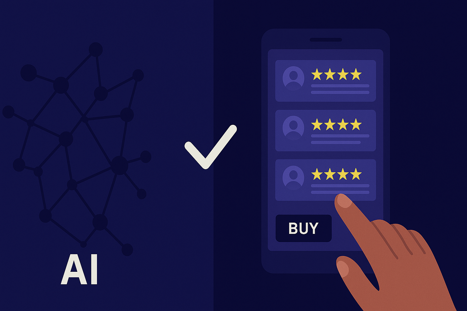
Over time, the request for these kind of themes in all apps have risen and it just happens that while creating a topic board for Snapchat (and by “creating” we mean running through a three-minute procedure, thanks to AI!) we came to understand that a frequent request of many snapchat users all across the world, is in fact the dark mode.
Since a great number of users choose this app to use for long hours for purposes such as texting, or content creation, they have started to demand that it keeps up with the trendy features and want this app to include the dark mode.
We are all socially connected through many digital platforms and we communicate! That’s just the rule #1 of human nature! If business owners were able to listen carefully to all these voices and demands, they could easily find their very own golden beacon of success through all this nonstop social commotion! Pivony is here for that exact purpose; giving out the opportunity of understanding user-demand perfectly and creating chances of reacting instantly. Now dark mode was just one example among many. As an app grows, so does the criticism and so does the number of chances the developers will get at picking up on these feedbacks and improving their applications in time to react to the market and maybe finally getting ahead of their rival developers. It all comes down to listening to their customers!
And the Gold medal goes to the Companies using Multi-Replies
Just imagine what could result from sending the following message to your users with the multi-reply functionality of Pivony:
“Hey! We personally thank you as the Snapchat customer service team. Thanks for your efforts at making our app better for you and for other millions of Snapchat users! When you update your app, you will have the dark mode enabled. Keep snapping!!”
This could seem like a very simple and clean approach but it will make a huge difference in becoming a more customer-centric organization.
Click To Analyze Snapchat Insights
.png)


