Know What Your Customers Feel and Why They Stay or Leave
Analyze millions of conversations in minutes and surface the "why" behind churn, loyalty, and NPS, so your team acts faster. Observe the competition and gain new strategies.
.png)
Products
Voice of Customer Analytics
Analyze customer feedback across all channels

Liveboards
Real-time dashboards and insights

The Agentic AI
AI-powered customer journey automation

Use Consumer Opinions To Drive Growth

Create your VoC dashboard in minutes
connect reviews, calls, chats, surveys or upload files.
Get instant AI insights
themes, emotions, and root causes of churn & loyalty.
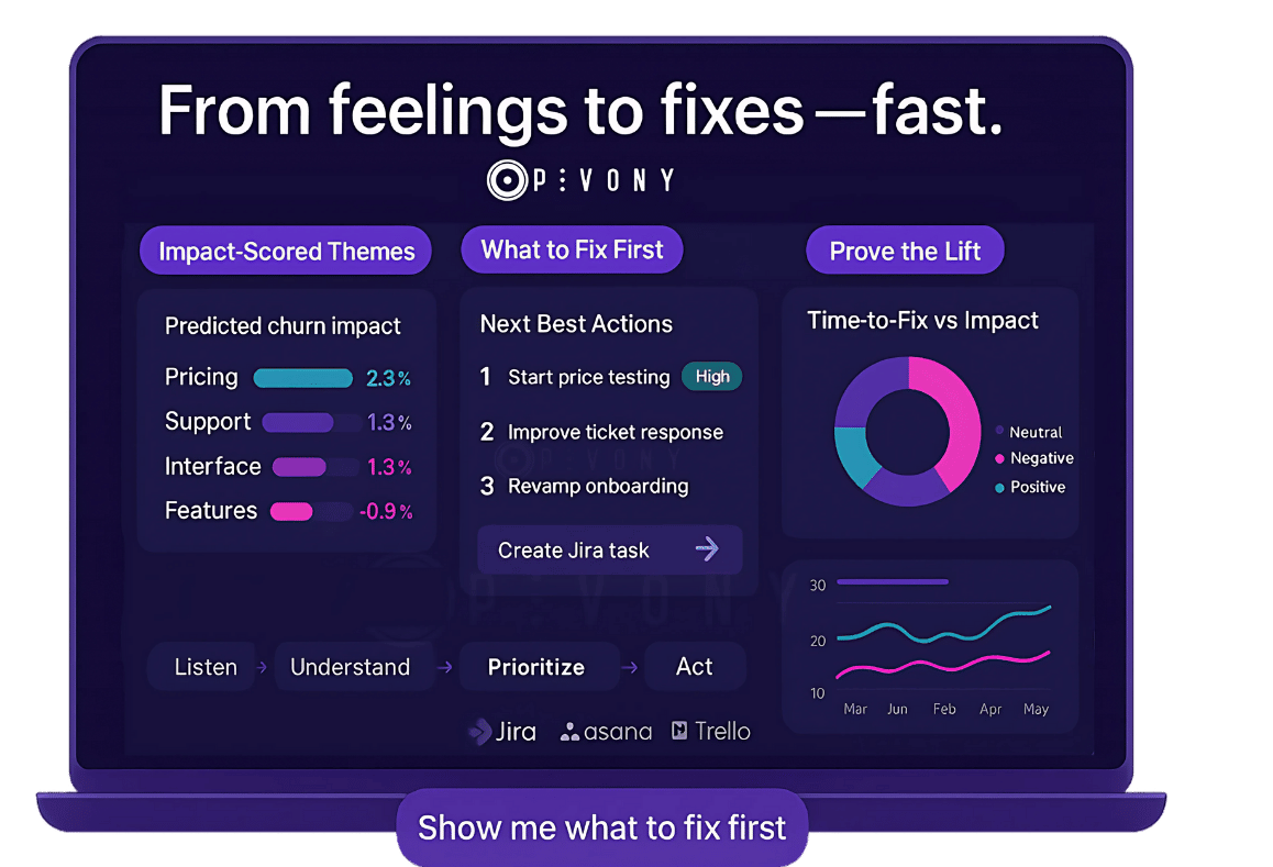
Receive prioritized, strategic actions
with expected impact on retention/NPS.
Sync tasks to Jira/Asana/Trello
to track fixes and measure lift automatically.
Your DX Score—And How It Stacks Up
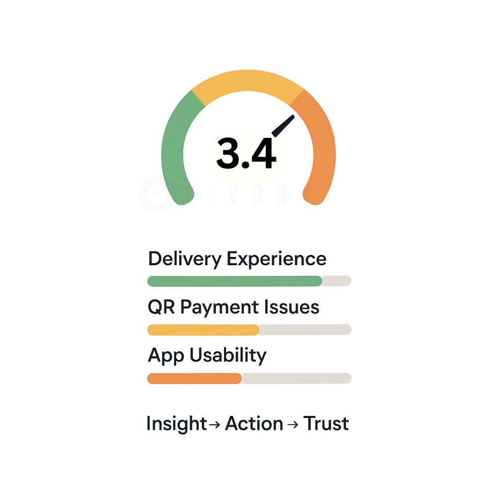
Estimate your score from millions of real opinions. Understand the drivers, not just the number.
Compare with category leaders
Find the issues hurting churn & NPS most
Get a ranked "Next Best Actions" list
Sync to Jira/Asana and measure results
CX leaders choose Pivony to close the Empathy Gap

.png)
"We believe that our partnership with Pivony provides significant gains for our company in creating happy customers. We listen closely to our customers and focus on empathizing with them."
Hande Kozlu Gültakan
Head of Customer Experience, Vodafone
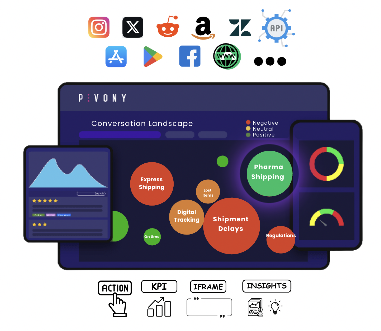
Private + Public Data Streams
No-code. Start instantly to capture actionable insights.
The Agentic AI for Customer Journeys
Pivony steps in at the right moment of the customer journey: Reaching out, understanding the experience, and triggering the right next action.
More Details
Reaching out
Automated customer engagement at the right moments
Understanding the experience
Deep insights into customer journeys and interactions
Triggering the right action
Proactive responses that drive customer satisfaction
Liveboard by Pivony
AI generated summaries, highlights, brainstorming ideas and more. This will transform the way how the entire organization takes care of its customers.

Discover the use cases
Competitive Intelligence
Analyze competitor strategies and market positioning
Customer Experience Analytics
Deep insights into customer satisfaction and pain points
Brand Reputation Analysis
Monitor and manage your brand's online reputation
Campaign Strategy
Data-driven campaign planning and optimization
Benefit from All Platform Features with a Yearly Membership
Maximize the impact of consumer data by getting insights through self-service platform.
Use Customers Data To Drive Growth
Create a dashboard with preferred data source
See overview of your analyzed data. Ensure data continuity with dynamic dashboards.
Detect Trends & Observe Anomalies With Topics
Discover AI generated topics
Explore key trends of your industry. Create custom topics with your own rules.
Establish team KPIs from multi-channel customer feedback
Track performance trends. Receive anomaly alerts.
Create teams and share insights, dashboards, KPIs
Fully adjustable Team KPI view for every team. Manage teams, accounts and quotas dynamically.
AI-generated root-cause analysis and recommendations
Integrated with task management systems. Track trends and see how many people may be affected.
Specify which keywords, products or brand you would like to analyze
Analyze internal data without requiring any integration. Analyze continuously expanding internal data with API-based integration.
Integrations To Drive Value
Learn about the different third party applications that can integrate directly with Pivony
Jira
Asana
Trello
Slack
Salesforce
Zendesk
Our latest articles and reports
Guides, Tutorials and Articles and more...
Discover how Pivony can support you!
Set up a meeting to begin.